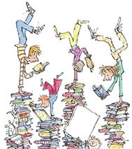
Above: Illustration by Quentin Blake
Our task
Last term, in our art classes, we were working on a very creative task that consisted of picking a book of our choice and creating a booklet containing various key features of it. These features were: front page (style of our choice), character (pen and ink), scene (pencil), item (oil pastel print) and word (acrylic collage).
Journey to the Centre of the Earth
I chose this book because when I read it, I felt a strong sense of adventure, that inspired me greatly. I could picture every single part in my head as though it was a movie. This book also gave me tons of ideas, so I thought it was ideal for the job.
For the outside cover, I decided to go with a sunset background with an enormous exploding volcano, the key feature of the book, and the title written in an eye-catching font. This was my favourite page, as it was bright and colourful. The back cover consisted of a continuation of the front, with a simple quote at the top.
My front page had a treasure map-like appearance with an outlined trail. I drew Axel, the protagonist, and some tropical plants on the character page using a calligraphy pen and blue and green ink.
Next, on the scene page, I drew the underground sea, with Axel and the professor on a wooden raft, and a sea monster in front of them. I tried to make it look dramatic, and it turned out just the way I imagined it.
I picked a compass as my item, with the background as a pastel watercolour contrast, with the print on top. Finally, for the last page, I picked the word “voyage”, as it best describes the theme of the book.
The Girl of Ink and Stars
I picked “the Girl of Ink and Stars” because I found it very interesting while reading it. The descriptions were so thorough that I could imagine the scenes very vividly. I decided to have a colour theme; some pages are black, white and gold, others are more colourful.
I tried to make the cover look like the sky at night, and wrote the name of the book so that it looks like stars. My front page is very similar to the cover, there is only a slight difference in colour.
The main character of the story, Isabella, appears on the cover of the original book in profile. I decided to keep it that way, only instead I drew her using different geometric shapes.
This scene is one that was most life like for me. I tried to show it from the way I imagined it, as if I stood there with them.
The item I chose was a simple map.
Lastly, the word I wrote is “journey” because the whole book centers around adventure.
Written by Sofia Pak and Nika Udaltsova Yr 8.

Illustrations by Sofia Pak Yr 8

Illustrations by Nika Udaltsova Yr 8


